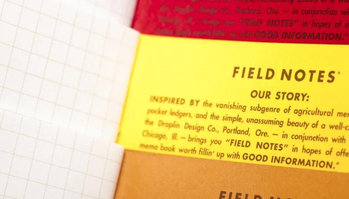
The Field Notes 2015 limited editions are now available for purchase on our website. Take this opportunity to grab hold of the following:
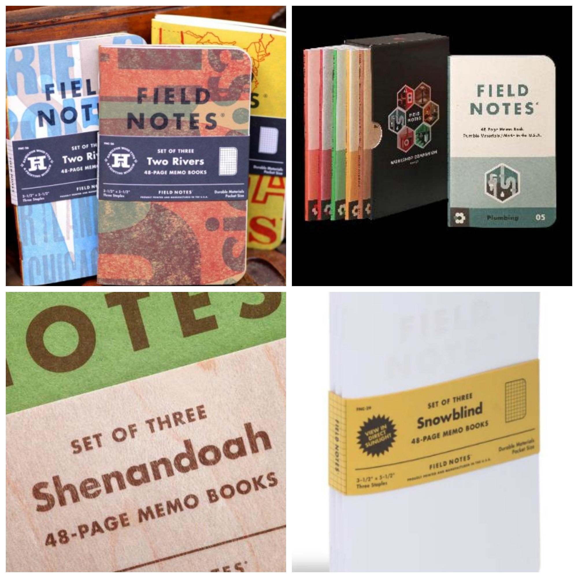
Field Notes Two Rivers, Spring 2015
Field Notes Workshop Companion, Summer 2015
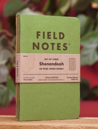
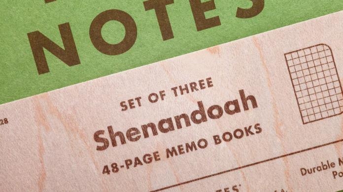
Field Notes Shenandoah, Fall 2015
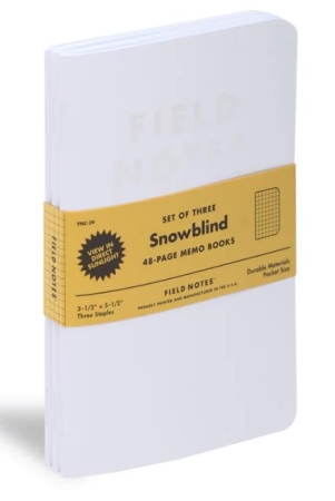
Field Notes Snowblind, Winter 2015
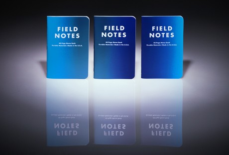
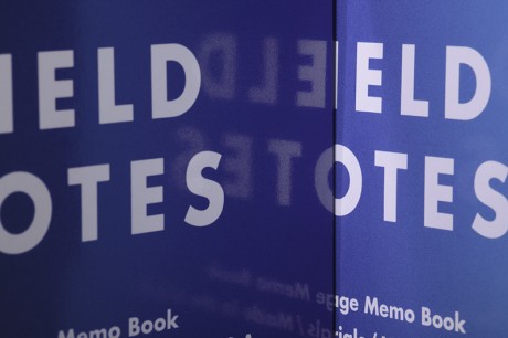
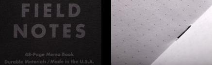
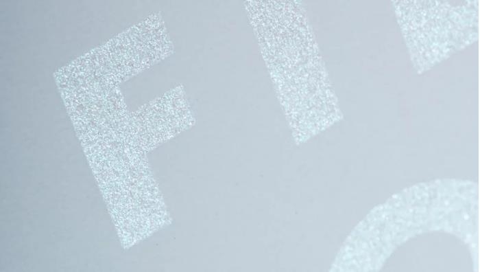
FIELD NOTES WINTER 2015 EDITION: SNOWBLIND
From Field Notes:
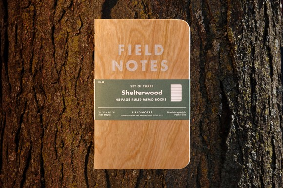
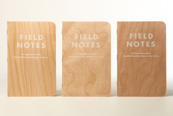
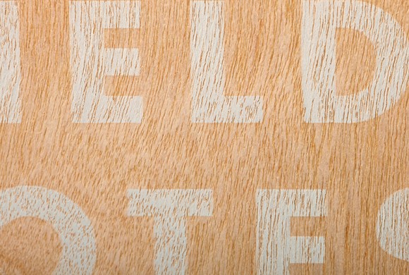
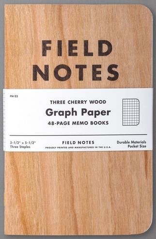
FIELD NOTES FALL 2015 EDITION: SHENANDOAH
If you want paper that’s one color on one side and another color on the reverse, the simplest thing to do is to start with white paper and print a different ink on each side. We’ve done that, it’s simple, it works well. But we’re Field Notes; if there’s a more difficult, expensive, and awesome way to achieve the same result, we will find it. In this case, it’s called duplexing. Using brute force and adhesives, you take two different colored papers and fuse them together so that they become one.
We’ve used duplex paper before (in our American Tradesman and Raven’s Wing editions) but this time we had specific paper and colors in mind, and an off-the-shelf solution wouldn’t work. So for the very first time, we made our own.
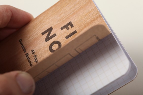
The Shenandoah edition features three green French cover stocks that match the leaf color of three trees found at Shenandoah National Park: the Sweet Birch, the Chestnut Oak, and the Red Maple. Our new friends at Platinum Converting in Itasca, Ill. fused each of the green papers to a contrasting French text-weight paper that matches the tree’s fall foliage.
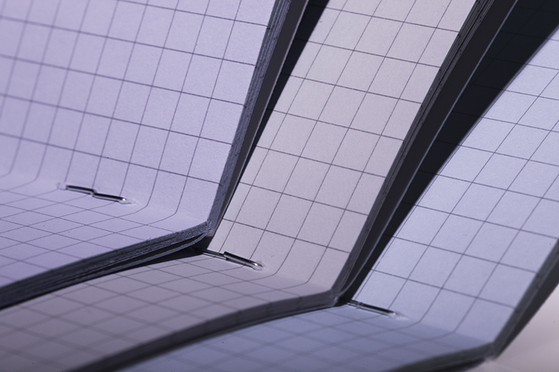
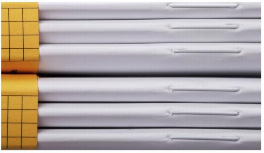
These extra-sturdy duplexed covers have a classic, beefy feel to them, reminiscent of early Quarterly Editions like Mackinaw Autumn and Just Below Zero. Beefier, actually, since we’ve upgraded our body paper to 60#T Finch Opaque “Bright White,” with a 3/16″ graph. Each features an illustration of a leaf on the back with some facts about the tree. The belly band is real birch veneer, just because it looked so darn good with all that green.
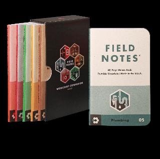
FIELD NOTES SUMMER 2015: WORKSHOP COMPANION
From Field Notes:
The right tool for the job isn’t always drop-forged from chrome vanadium steel or plugged into a 220-volt outlet. Whether you’re rebuilding the engine in a 1967 Pontiac GTO or converting the home office into a nursery, any big project starts with careful planning. Step away from the power tools and collect your thoughts, specs, and calculations with the new Summer 2015 Field Notes Workshop Companion.
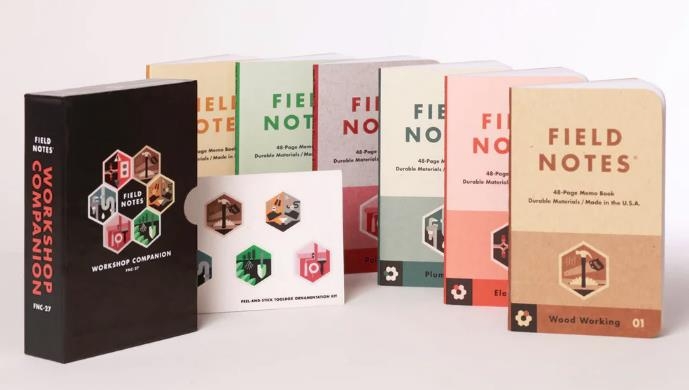
This 27th Quarterly Edition is a set of six books, boxed in a sturdy 60-pt custom slipcase with a sheet of crack-and-peel decals. Each of the books focuses on one DIY discipline Wood Working, Automotive, Gardening, Painting, Plumbing, and Electrical — each containing tips, reference materials and the usual Field Notes wise-cracking.
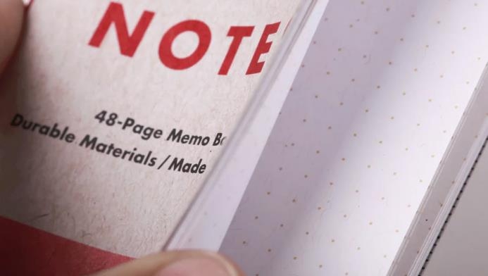
The six covers are color-coded to compliment six tones of 100-lb cover stock from the French Paper Company’s terrific new “Kraft-Tone” paper, their first new grade in five years. The 70-lb text Kraft-Tone “Standard White Kraft” body pages feature our dot-graph, and are bound with tough brass staples. Anyone fixing a switch, planting a bush, or painting a door jamb will find these books make a nice addition to their workbench, junk drawer or toolbox.
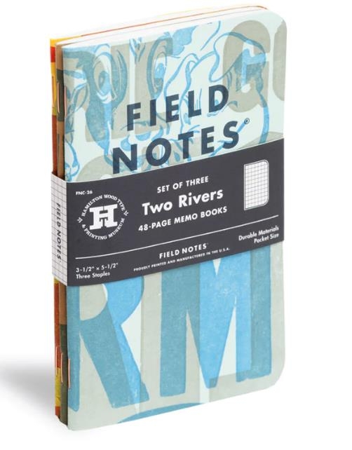
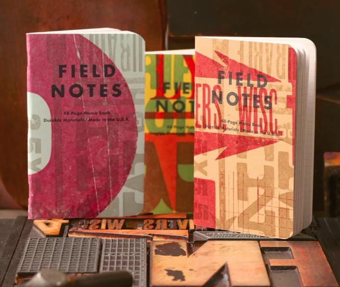
FIELD NOTES SPRING 2015: TWO RIVERS
From Field Notes:
Field Notes loves printing, history, Americana, and a good Wisconsin brandy old-fashioned, so the Hamilton Wood Type & Printing Museum is our kind of place. We reached out to our friends and neighbors at French Paper Co. of Niles, Michigan, who are also big fans of the museum, and they gladly agreed to help.
After months of planning and several trips north, our love for the museum and the town grew even greater, and we couldn’t be happier to support their work with our 26th Quarterly Edition.
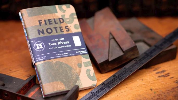
French Paper supplied four cover stocks for these books: Pop-Tone 100#C “Lemon Drop” and “Sno Cone,” Speckletone 100#C “True White,” and Dur-O-Tone 80#C “Packing Brown Wrap.” We hand-set several designs using Hamilton’s collection of vintage type and ornaments. Hamilton then printed our designs in two random colors on a 1961 Heidelberg GT 13″ × 18″ windmill press. Randomizing the designs, papers, and colors resulted in thousands of variations. Further variations were introduced thanks to the nature of wood type, letterpress printing, and the music playing in the print shop during the 200+ hours on press.
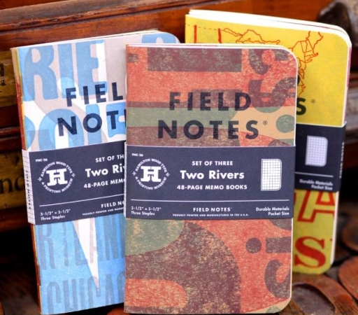
Back in Chicago, our logo and specifications were added with a hit of “Broadside Blue-Black” ink. Then the books were bound with 48 pages of Finch Opaque Smooth 50#T featuring our “Double Knee Duck Canvas” graph grid. Three copper staples hold ’em together. As always, they’re all-U.S.A.-made, with a lot of love from the shores of Lake Michigan.
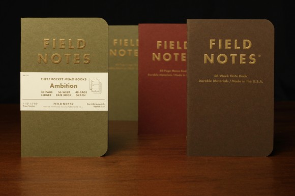 Our old friends French Paper Co. of Niles, Michigan supplied “Olive,” “Wine,” and “Chocolate” 100# Speckletone for the covers, with production bouncing around the Midwest for the last few weeks. Printing started in Chicago’s suburbs at eDoc, then the covers were delivered to Nu Wave Diecutting & Finishing in downtown Chicago to emboss the cover logo. After a trip back to eDoc for bindery, they were trucked down to Liberty Book and Bible in Indianapolis for a process nearly as old as bookbinding, but all-new to us!
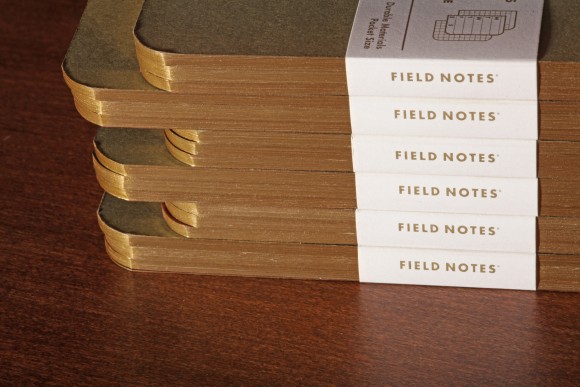 Gilding is an ancient technique once performed by artisans with gold leaf, mallets, and secret mixtures of binding paste. A century or so ago the process was mechanized, but it’s still ridiculously complex. The books are clamped into small batches, then make three passes (once for each edge) through an Ochsner edge gilder, which sands the edges smooth with varying grits of sandpaper, then fuses metallic foil to the edge with heat. It was certainly the strangest piece of printing machinery we’d seen, until a few minutes later when we saw a pair of Ochsner round-corner gilding machines in action.
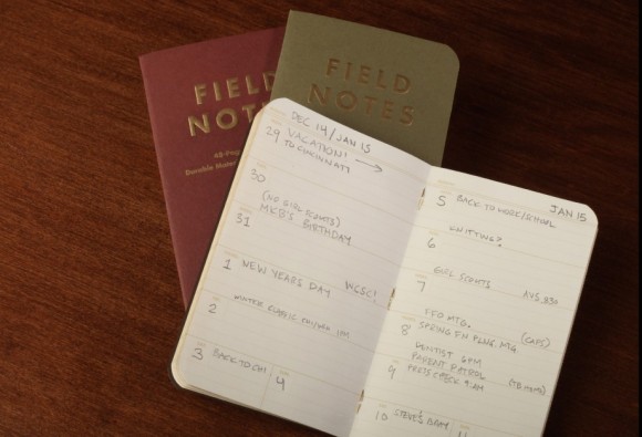
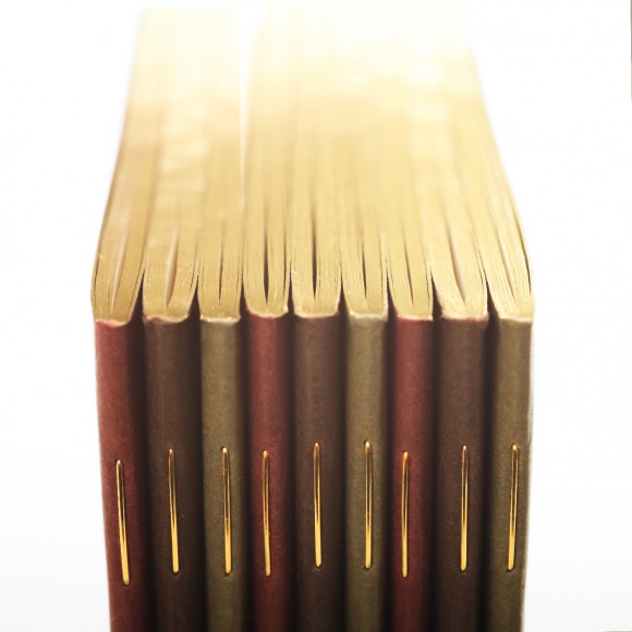 But that’s not the only FIELD NOTES first in this edition. The “Olive” book is ruled in ledger lines (which you may remember from FNC-16, “Traveling Salesman”), and the “Wine” book is graph paper, but the “Chocolate” book features 56 pages ruled in a weekly datebook format! The body paper is Cougar Opaque 50# “Natural White” text-weight vellum printed in “Double Knee Duck Canvas” ink. With all that gold going on, gold staples were the obvious choice to hold the books together.
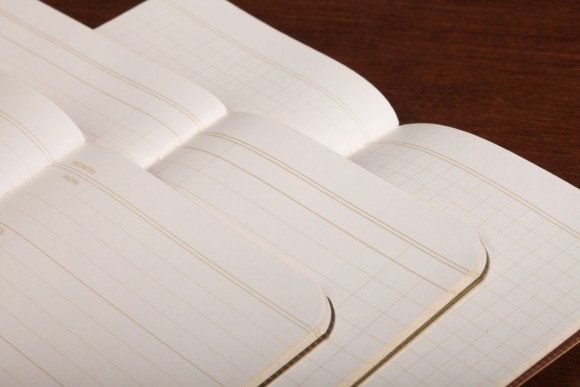 With a datebook, ledger, and memo book in hand, projects of any scope become more manageable. And we bet the elegant gilded edges will help get you out of bed a bit earlier and start getting things done. All that’s standing between you and your goals are a whole bunch of notes, facts, lists, and figures, and now you have the perfect place to write it all down.
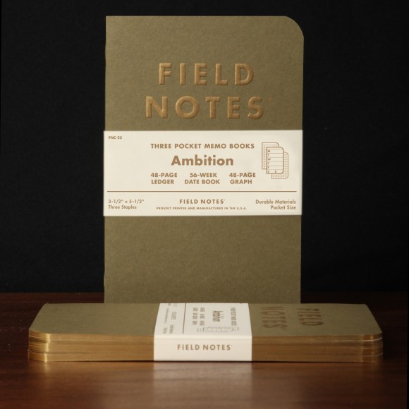
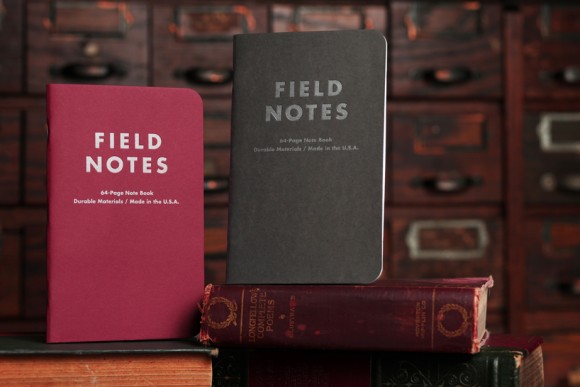
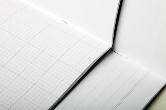
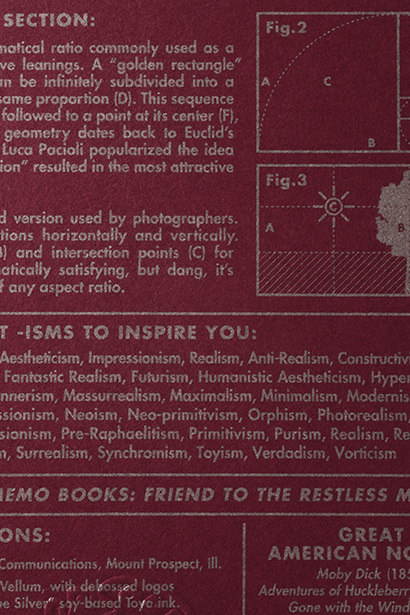 The “Arts” Note Book is designated for creative musings, featuring a wine-colored cover containing a wealth of handy information for writers and fine artists. Its 64 interior pages are quarter-inch ruled in “Academy Gray” for prose and poetry on the right-hand (“recto”) side, and blank on the left-hand (“verso”) side for sketches, scribbles, and sentence diagrams.
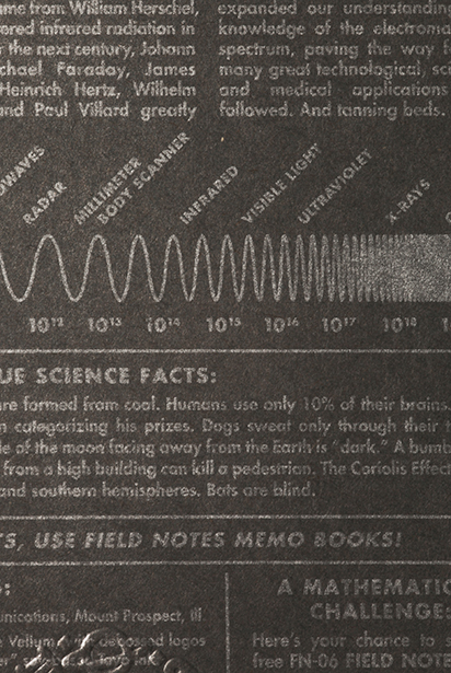 “Sciences” sports a dark slate gray cover loaded with the formulas, theories, and ideas you need to get you through your day. The recto pages feature an all-new “Engineer’s Graph” subdivided into one-inch, half-inch, and tenth-inch squares in “Academy Gray.” As with “Arts,” the “verso” side of the sheet is blank, awaiting your diagrams, calculations, and observations